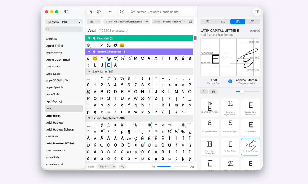
In short: To test and compare fonts on a Mac, set the same sample text in several fonts and look at x-height, letter spacing, individual characters, ligatures and character coverage (glyphs). Font Book in macOS shows several fonts with your own text. Online tools like Google Fonts and Wordmark.it show your text in many fonts at once. A character map like PopChar places one character in two fonts side by side, with guides for baseline and x-height.
Why compare fonts
You're looking for a font for a logo, a headline or a brochure, and 3 candidates are left. You get a file in a font you don't have and need a replacement that looks similar. Or a translation needs ő, ł and ş, and you want to know which of your fonts can handle them before the layout goes to print.
In all three cases you need the fonts side by side, with the same text, at the same size.
What to look for when comparing
x-height and baseline
The x-height is the height of a lowercase x. Two fonts at the same point size can look very different in size, because one has a tall x-height and the other a short one. That's why 12 pt in one font looks bigger than 12 pt in another.
The baseline is the line the letters sit on. Compare fonts on a shared baseline and you see differences in x-height, cap height and descenders right away.
Width and letter spacing
Some fonts run wide, others narrow. Letter spacing (tracking) describes how much space the letters have between them. Every font sets it differently, and most text and layout apps let you adjust it on top of that.
Set a full line of your real text and compare how much space it takes. A narrower font or tighter spacing can save a line in a headline or a column.
Individual characters
Many fonts look alike until you check a few telling characters. Good test characters are the ampersand (&), the lowercase g and a, the digits 1, 4 and 7, quotation marks and the question mark.
Typographers like to test fonts with the word “Hamburgefonstiv”. It contains the letters where fonts differ most clearly and shows curves, bowls, ascenders and descenders in a single word.
Ligatures
Ligatures join two or three letters into one shape, such as fi, fl, ff or ffi. Not every font has them, and they look different in every font. If your text has a lot of fi and fl combinations, compare them directly.
German typesetting adds a rule here: no ligature at the joint of a compound word. In “Auflage” the f and l belong to different parts of the word (Auf-lage), so they're set separately.
Glyphs: does the font have every character?
A glyph is the visual shape of a character in a specific font. The “a” in Arial and the “a” in Georgia are the same character, but two different glyphs. Ligatures and alternate forms of a letter are glyphs of their own, too.
A font can look perfect and still lack the €, the ñ, Cyrillic letters or the arrow you need. Check the character coverage before you decide.
Here's how: write down the special characters your text needs (currency symbols, accented letters for each language, arrows, math symbols, typographic quotation marks). Then check each one. In Font Book, open a font's repertoire and look for the character there. If you have many fonts and just one character in mind, PopChar is faster (see option 4).
4 ways to test and compare fonts on Mac
1. Font Book (included in macOS)
Font Book is installed on every Mac. In sample view it shows several fonts as blocks with a sample sentence. Double-click the sentence and you can type your own text. In grid view, double-clicking a font opens its repertoire with all characters and symbols. The info view shows details like supported languages and the manufacturer.
You can also print fonts from Font Book: as a catalog with one sample line per font, as a repertoire with every glyph, or as a waterfall with the same text in several sizes.
Good for: a quick look at the fonts you already have installed, at no extra cost. Limits: Apple's guide doesn't describe a view that puts a single character in two fonts side by side, and no guides for baseline and x-height.
2. Test and try out fonts online
Online tools are the fastest way to try out fonts: you type your text and see it in many fonts right away. The main difference between them is which fonts they show you.
Testing web fonts with Google Fonts: On fonts.google.com you enter your own preview text and see it in the fonts of the library. Filters narrow the selection, for example by category or language. The fonts are free and available under open licenses, which makes Google Fonts the first stop for websites.
Testing installed fonts with Wordmark.it: Wordmark.it shows your text in a grid with every font installed on your computer. You mark favorites, filter them and compare your shortlist. This works in Chrome and Edge: the browser asks whether the site may access your fonts. According to its own help pages, Wordmark.it currently doesn't detect installed fonts in Safari and Firefox. Uploading your own fonts is only possible with the paid Business plan.
Viewing font files in the browser: There are also font viewers you drag a font file into to see its glyphs and metadata. Check first whether the file stays in the browser or gets uploaded to a server. For purchased fonts, the license often doesn't allow uploading.
How to test online in a useful way:
- Use real text instead of placeholder text, with the accented letters and special characters you actually need.
- Set the size the font will be used at later: large for headlines, small for body text.
- Mark 2 to 3 favorites and compare only those side by side.
- Finally, check the characters that matter, letter by letter (see glyphs above).
Good for: choosing web fonts (Google Fonts) and quickly going through many installed fonts (Wordmark.it in Chrome or Edge), without an extra app. Limits: Google Fonts only shows fonts from its own library. Wordmark.it only detects installed fonts in Chrome and Edge. Don't upload licensed font files to websites without checking first.
3. In your text or layout app
Set a line of your real text, copy it a few times, give each copy a different font and place the lines next to or below each other. In a design app you can also stack two text layers on top of each other and compare the shapes closely.
Good for: testing fonts with your real content, in the layout you actually use. Limits: manual work, and with many candidates it takes time.
4. PopChar: compare characters across fonts
PopChar is a character map for Mac and Windows, developed by ergonis and first released in 1987. PopChar 11 adds a new comparison view for fonts.
- Side by side: PopChar places the same character in two fonts side by side, with guides for baseline and x-height. You see differences in shape and size right away.
- Compare with all fonts: Compare the current font with every other installed font, then pick one for a direct comparison.
- Which fonts contain a character: Select a character, and PopChar shows how many of your installed fonts contain it. One click selects all of them in the font list.
- Custom sample text: Enter your own text and see it in the selected font in different sizes.
- Font info: name, style and version of the font.
Good for: typographers, designers, editors, translators and print shops who compare individual characters and need to know which font has which characters. Limits: PopChar is paid software. You can try it for free first.
The 4 ways at a glance
| Method | Good for | What you compare | Cost |
|---|---|---|---|
| Font Book | a quick look at installed fonts | sample text in several fonts, all glyphs of one font | included in macOS |
| Online tools | web fonts (Google Fonts), installed fonts in the browser (Wordmark.it) | your text in many fonts at once | Google Fonts free, Wordmark.it with a paid plan for extra features |
| Text or layout app | real content in your own layout | your own text, set by hand | included in your app |
| PopChar | individual characters and character coverage | one character in 2 fonts with guides for baseline and x-height; which installed fonts contain a character | paid, free trial |
FAQ
How do I compare two fonts side by side on Mac?
Set the same text in both fonts in your text or layout app and place the lines side by side. For a single character, PopChar shows it in two fonts side by side, with guides for baseline and x-height.
What are glyphs?
A glyph is the visual shape of a character in a specific font. The same character, such as an “a”, has a different glyph in every font. Ligatures and alternate letterforms are glyphs too. In Font Book you see all glyphs of a font in its repertoire.
What is x-height and why does it matter when comparing?
The x-height is the height of a lowercase x in a font. Fonts with a tall x-height look bigger at the same point size than fonts with a short x-height.
Why does the same font size look bigger in one font than in another?
Point size measures the whole body of the type, including the space above and below the letters. Fonts differ in x-height, cap height and letter spacing, so 12 pt looks big in one font and small in another.
How can I test fonts online?
For web fonts, enter your own preview text on Google Fonts and see it in every font in the library. Test your installed fonts with Wordmark.it in Chrome or Edge: once you allow access, the site shows your text in every font on your computer.
Can I compare fonts that aren't installed?
Yes, with online tools like Google Fonts, as long as the tool provides the font. In Font Book, in PopChar and in your layout app, the fonts need to be installed on your Mac.
Try PopChar: Compare characters across all your fonts and see which fonts contain a character. Download the free trial · All PopChar features · What's new in PopChar 11
Sources
- Apple Support: View and print fonts in Font Book on Mac (German)
- Apple Support: View and print fonts on your Mac in Font Book
- Wordmark.it help: How does it work, Seeing all your fonts, Uploaded fonts
- Google Fonts